Sunday, October 28, 2018

Module 9; video review


1.     I watched The Power of Art; Caravaggio and the Leonardo da Vinci: the mind of the renaissance. I picked both videos because I was hoping to learn something new which was unlike what I had learnt in my art history courses. Both artists have been spoken about in my house hold because they are both my mother’s favorites, so it was inevitable that I would decide to pick them.

2.     The power of art; Caravaggio showed us a difference between these two artists, being someone who never used paint and often stuck to drawing was a big difference in how he became who he was. Learning by viewing artworks like so many before him, he was able to learn to understand that emphasizing light and dark was a major focus. He often chose to show the different side of life, such as the imperfections of fruit.

With the second video were learnt more about Da Vinci, who he was and how he became who he was. He often studied and kept notes and records of it in order to save his ideas that would often reflect in his works.

      3.     These videos stated once again what had been stated within the text.

4.     These videos were each interesting in their own ways. They described much about the ways these artists grew up. I like how they pointed out the more important aspects in a subtle way and put the major points about these artists across to the viewers.


Sunday, October 21, 2018

      1.    I selected my video about The Greek Awakening, because I am currently taking a Greek art and architecture class for my major and I am finding it a very interesting history and the cultures as well as how the arts changed and developed in the way that they did.


2.    I think mentioning how now we can look at old paintings and images that people within out lineages and people of the past have created and this allowed us to interpret our own opinions upon the works. I think that it would be interesting to understand why they painted and created what they did but that is very difficult to figure out now. With watching the Greek video, I really liked how I could relate to it because it is my major. I like that art historians can figure out meanings with little items and figure out how they are able to find things out like where they are from and how it was created. I like how the fuller figurines were woman and sometimes it they have stripes it means that they are mothers.  


3.    Within art and the texts, we can see how they both mention the symbols and different body languages within the arts.


4.    Watching these videos, it was possible to learn new things and help us make connections and figure out what each style means and how it blended over time to create the things that we see now. With the way works were created then and now everything is still an amazing work of art.


Sunday, October 7, 2018

Video Review

I didn’t realize that marble was a product of limestone that has been manipulated by the earth over many many years. I also found out that glass, even though I knew it was made my heated sand, I always thought there was other products that had to be added into the overall mixture. I also tend to forget that ceramics are everywhere in different styles and molds. The fact that sculptures were often founded by drawing and then made of clay before creating a larger scale eventually ending with the overall product. I thought that they just drew it out, found the measurements and created the over all sculpture so, finding out that there are more steps involved was interesting.
The readings and the videos relate to one another well, I think that after watching the videos the understanding of the process and how much work goes into it was clearer.
I think that the films were enlightening. I started out with the shorter video, not just because it was a smaller time frame but because I remembered going to Corning glass as a child and found it interesting. The second film was longer and as much as  I love art I always worry about nodding off watching the films, there were a few times I had to rewind to fully comprehend what was being said but it was actually quite intriguing. Being able to see how much work and time and effort that goes into the processes really opened my mind to how hard and time consuming it really is.

Peer Reviews


Within both blogs, I thought they both matched the descriptions well. They both obviously spent their time finding what they wanted to use for each image and took their tie to capture the right angles. 

There were a few images where you could see the images doubling within two different elements, yet they matched well with what they were placed with.

I don’t believe there were any images that were the same as my own.

One of my peers posted an image of a Pumpkin Sculpture, which peaked my interest, because it was a very simple yet delicate looking image, and I personally love the fall and the items associated with it.
I think it was a good thing to have us review each other’s works, just because it allows us to learn and see how our ideas of art may differ from the art works of others.

I liked the comments that I saw. I always feel as if I’m not going in the right direction and a few of the comments I received validated that I am.

Sunday, September 30, 2018

Logo

I have many thoughts on creating this logo. It took me a while to configure what I wanted to use, which is my initials and the colors of flags as well as a plane in a clockwise motion of her wary of lived and how I grew up traveling the world.

The process that I used was that I took my initials because I use them with everything in my social media to my emails to my school work, I had a sketch out multiple different ways to have them create the initials without really looking as if they were my initials. Within the space as I decided that it would be a good idea to create the flags of the countries that I grew up and lived in in the clock word way around the rectangle showing in order of which country I grew up in order. I also decided to put a plane in the middle of each flag do you show the direction that my life path has taken so far, it shows the places that made me who I am as a person today. I started mixing media, with colors pens and pastels to create the overall look.

To me I think the most important discovery while creating my logo was about the design aspects, how to create it, how to incorporate everything that you wanted to incorporate as well as what materials would look best as a for a final product. 


Albright Knox

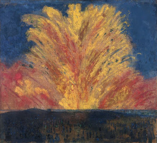
I think the artist that made more of an impact on me was both James Ensor, and Jasper Johns. Both of these works are bright and colorful and the way that they are put together makes you wonder and think, They also make your brain work which is why I think it made most impact on me because I was trying to figure out why they did what they did and how these pieces of work. They are both images of things that I like, growing up I loved fireworks and the excitement that was involved with them. As well as the aspect of numbers and colors working together, for me and working with children it involves all the aspects that they need to be taught from the beginning.


I feel most connection to both Jackson Pollock and Helen Frankenthaler, because of the way that they created these works of art and the way I feel about how I like to create works of art. You can see the emotion and the confusion and the passion that both of these artists put into their work, The blending of the colors the spotting of the paint, the mixture of the random colors that are intriguing to look at and try to find the story behind them.


There are two works of art that I honestly want to know a little more about which is both by Joan Mitchell and  Paul Cézanne . Both of these works are not showing full figures which is what I would like to know what like what were the artist actually seeing in order to create what they created. Why did they paint these works in the style that they did and did their emotions play a role in the colors that they used.


Sunday, September 23, 2018

1. Creating the value scale and the color wheel was not something new to me but it is always different each time you try to create it, you picture one thing in your head and it rarely happens as easy as you think.

2. I personally like creating the value scale more than the color wheel, just because I like to use charcoal as my medium and I like how careful you have to be in creating a slight difference throughout the color. 

3. The most important discovery in the creation of these scales is that of being able to see how all of these colors and scales blend and how it works together in order to create the perfect image in the long run. 

4. I never knew about the changes in the color wheel, I always noticed that the middle would turn brown instead of black, I think its important to learn this in order to create the colors and blend them in the proper ways instead of being off every time even if it is just a small amount. 


My images of both of my scales are failing to upload today. I plan on uploading them on another laptop in the morning and editing my post to show them.